
How To Use the Dashboard
Your home for saved charts, metrics, and workflow insights.
The Dashboard is where you can view all your saved charts, explore live metrics, and monitor the performance of your workflows.
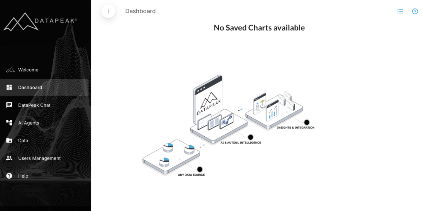
When you first create your DataPeak account, your dashboard will be empty, this is normal.
You’ll fill it by creating and saving graphs through DataPeak Chat.
This guide walks you through how to populate, customize, and manage your dashboard.
1. What the Dashboard Is For
The Dashboard gives you a quick visual overview of your data by displaying:
Saved charts
Key performance metrics
Workflow summaries
Trend visualizations
Create table and/or graph options
It updates in real-time as your datasets or agents change.
2. How to Add Your First Chart to the Dashboard
Because new users start with an empty dashboard, the first step is to generate a chart. There are two simple ways you can do this:
Create a Chart/Graph in Dashboard
The simplest way to create a chart or graph is by navigating directly to the Dashboard and clicking the Advanced Graph or Add New Table buttons. These options will allow you to create your charts and graphs with easy steps from within.
Step-by-step: Creating a Chart in Chat
Go to DataPeak Chat
Click DataPeak Chat in the left-hand menu.Start a new chat
Click New Chat (top-left in the Chat page).Choose your Dataset
If you haven’t uploaded one yet, Chat will prompt you to upload or select an existing dataset.Generate an Advanced Graph
Request Advanced Graph.
You can select your graph type (e.g., line, bar, scatter, multi-axis, etc.) and adjust parameters.Review your graph
Chat will create the visualization and show it directly in the chat.Save the graph to your dashboard
Look for the Save button in the lower-right corner of the generated chart.
Give your chart a name.
Click Save.
Your graph is now added to your dashboard.
3. Viewing Your Dashboard
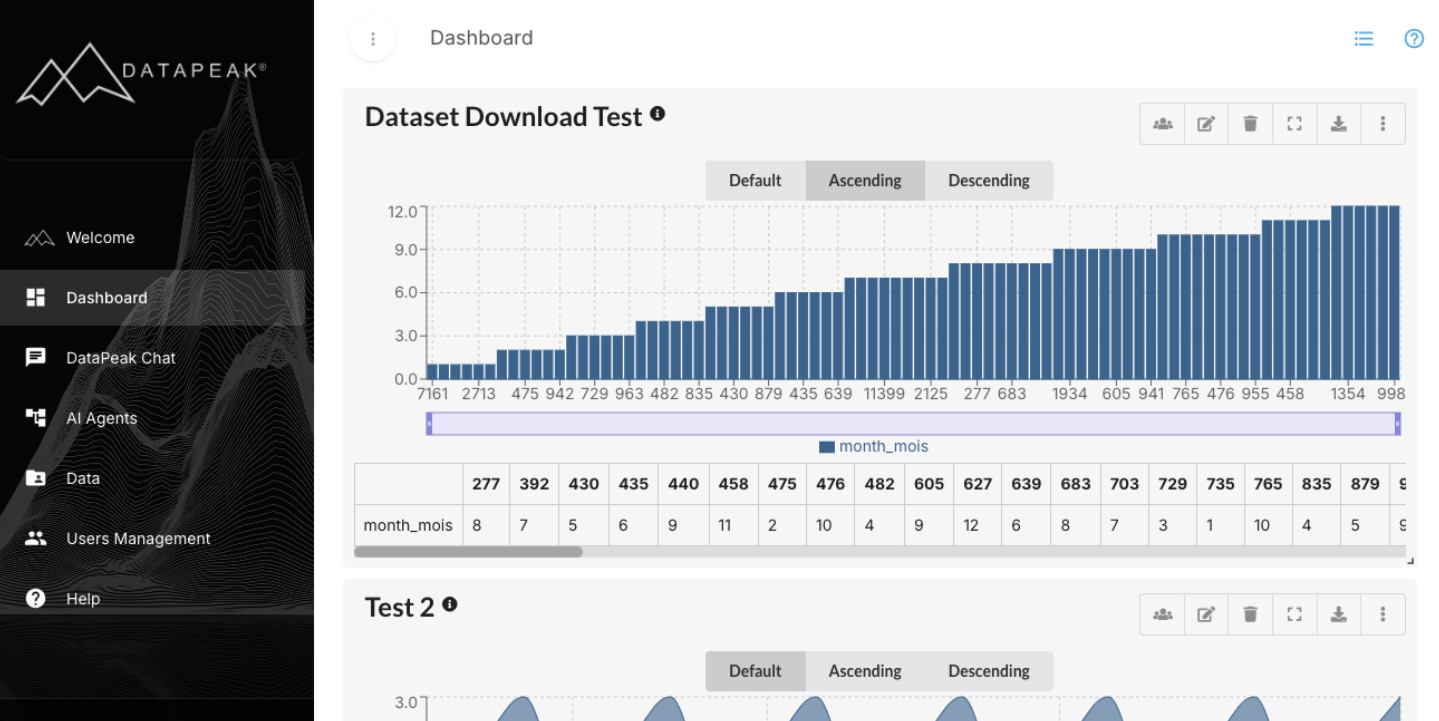
Once saved, your graph appears on the Dashboard page.
All graphs on your dashboard follow your permission level, meaning:
Users with the same access level can see the same charts
Admins can assign graphs to specific teams or groups
Charts belonging to deactivated datasets will not display.
4. Customizing Your Dashboard
Admins have access to full dashboard customization; regular users may have limited access based on their role.
Available Customizations
Rearrange Charts
Drag and drop charts to new positions on the dashboard.
Resize Charts
Use the resize handles to change width or height for better layout control.
Full-Screen View
Click the expand icon to open a chart in full-screen mode.
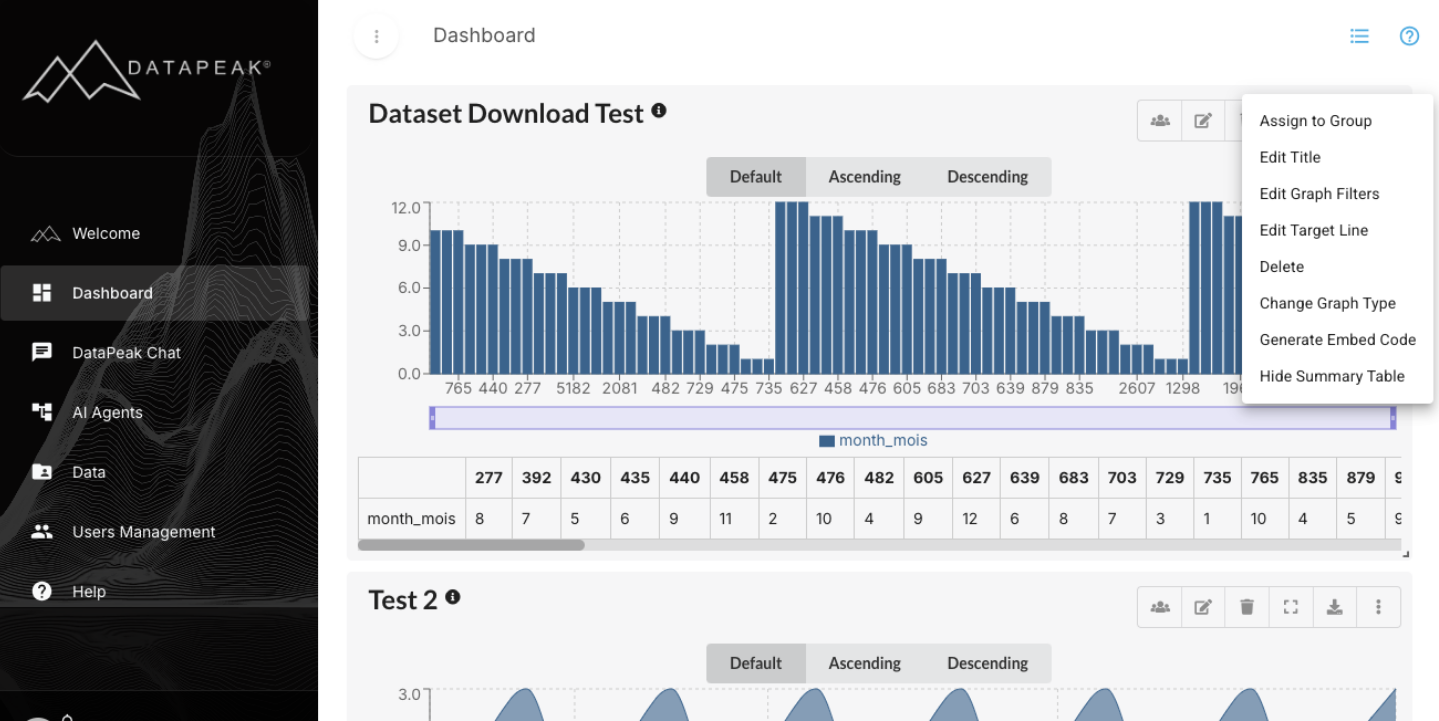
Edit Chart
Admins can:
Rename the chart
Edit filters
Adjust the target line
Change the graph type
Show or hide the summary table
Generate an embed code
Delete the chart
Users may or may not see these options depending on permissions.
Assign to Group
Admins can assign charts to specific user groups or teams.
Assigned charts appear automatically on those users’ dashboards.
5. Editing Data Within Charts
DataPeak provides powerful tools to refine your data directly from the chart settings.
Graph Filters
Two ways to filter your dataset:
Filter by Condition
Examples include:
Is Null
Is Empty / Not Empty
Equals / Not Equals
Begins/Ends With
Contains / Does Not Contain
Greater Than
Less Than
Filter by Value
See all unique values in a column and select the ones you want to include or exclude.
Column Management Tools
Rearrange Columns
Drag columns into a new order to improve readability.
Hide Columns
Remove irrelevant columns to cut clutter.
Rename Columns
Give columns more meaningful labels, improving understanding in your visualizations.
Column Data Updates
Create new columns, apply transformations, or correct erroneous values using the alias column tool.
Where to find the Filter & Management Tools
Choose the chart you will be modifying
Click on the three-dot menu in the upper right corner of the chart
Click Edit Graph Filters, the Edit Graph window will open
Click one of the Filter buttons in the header of your table
The Filter Options widow will open
Edit as needed
Click Apply to save your selections
6. Advanced Graph Options
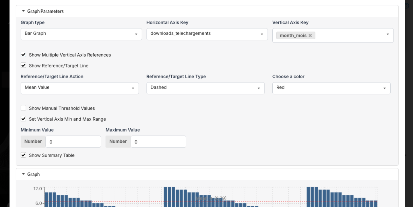
Show Multiple Vertical Axes
Perfect for comparing metrics with different scales.
Reference / Target Lines
Add:
A constant threshold
Mean value
Percentile value
Manual Threshold Values
Set different thresholds for each x-axis point.
Show Summary Table
View the full dataset behind the chart in table format.
7. Exporting Dashboard Charts
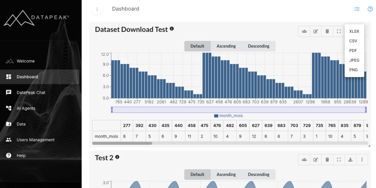
You can export any chart for reporting or presentations.
To export a chart:
Hover over the chart
Click the download icon
Choose your format:
Available formats:
XLSX
CSV
PDF
JPEG
PNG
Your file will download immediately or prompt you to choose a location depending on your browser settings.
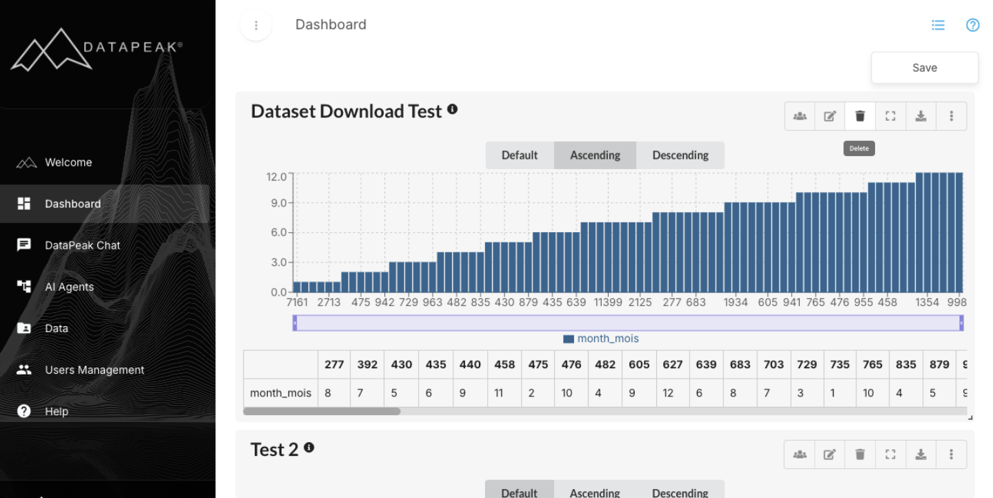
8. Saving Dashboard Layout Changes
After rearranging, resizing, or modifying charts:
Click Save in the upper right corner
This ensures all layout changes persist across sessions.
9. When You Should Use the Dashboard
The Dashboard is great for:
Monitoring KPIs
Tracking agent-generated metrics
Reviewing real-time data updates
Comparing trends across datasets
Sharing reusable charts across teams
Exporting visuals for presentations
It becomes more valuable the more charts and agents you build.